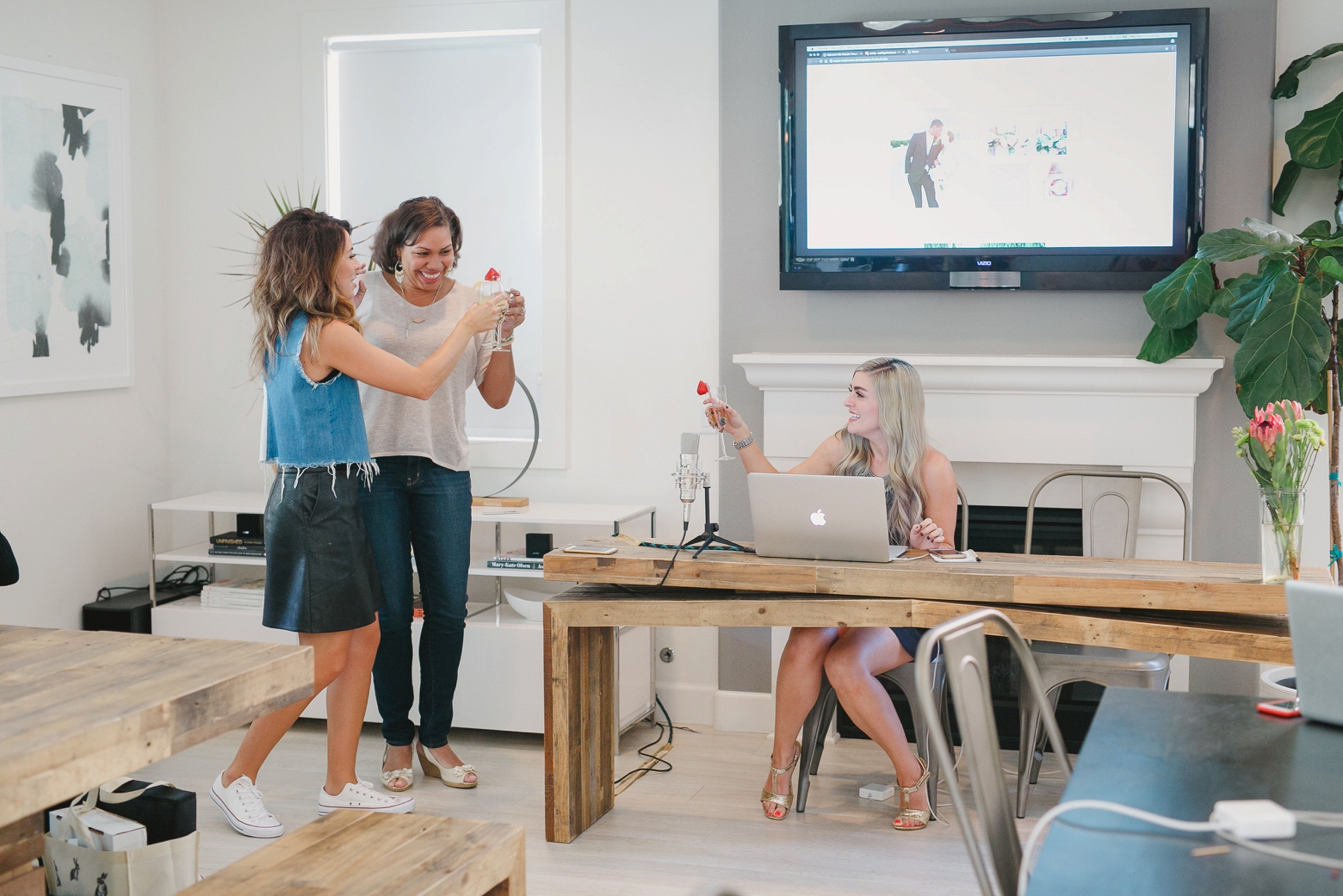
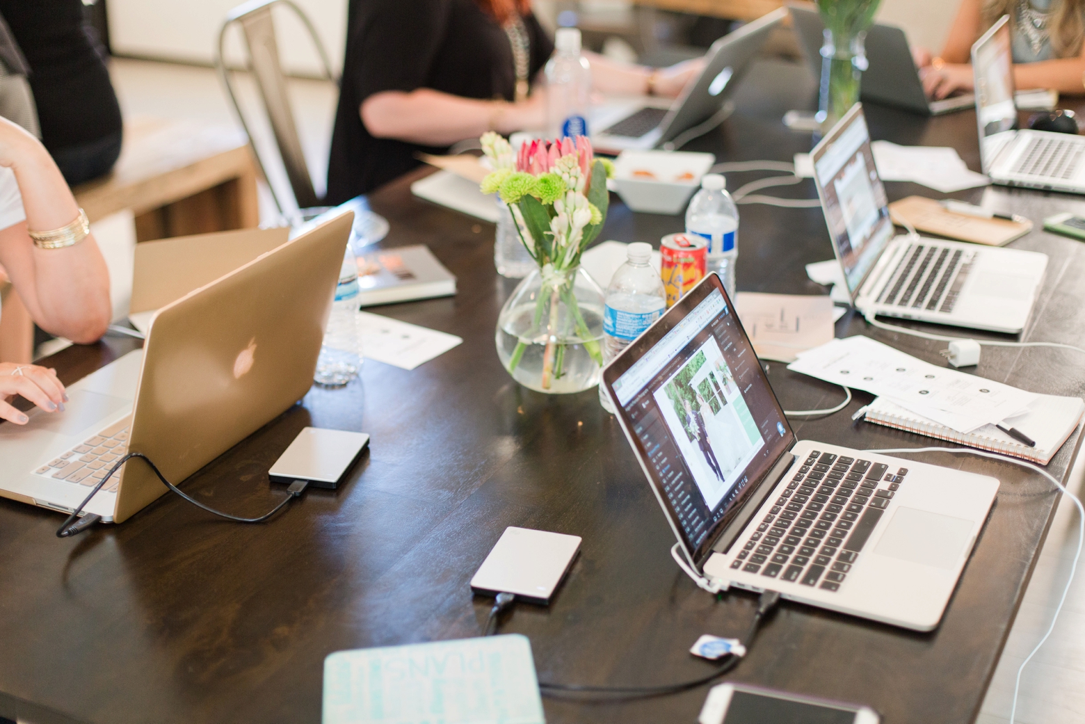
Exactly one year ago, I traveled with two of my photog besties to California for the GoLive Workshop! The main goal of the workshop was to build, design and launch a new website in just TWO days. It was by far the best investment of my career and I still love my new website! While hosting workshops and mentoring over the last year, I’ve had quite a few people ask how I knew it was time for a new website. I can’t believe I haven’t blogged about this yet so with being exactly 1 year out, I’m excited to reflect back on what made me take the leap!
Photo: Kristen Booth Photography

Here are my 3 reasons I knew it was time for a new website
1. I wanted more control
My original website was a ProPhoto template (through WordPress). It was a GREAT first website and did its job but I didn’t have much freedom! I couldn’t alter the design and I couldn’t move things around. GoLive is a web design company that offers beautiful and responsive designs on the ShowIt platform so now I can do anything I want on my website! It’s literally DRAG AND DROP. I can add icons, move aspects around, resize images and customize my mobile website! I have designed my own workshop pages in under 10 minutes and update galleries in seconds. I love GoLive so much that I had them design a custom Education page a few months ago!
2. I needed HELP
This was crucial. With my original WordPress site, I remember spending days.. even weeks on YouTube and message boards trying to figure out the platform. There was minimal support and I spent many nights crying over website crashes haha! I did my research on ShowIt and saw that they had a live help desk and an active Facebook group. The bonus was that the actual team (including the CEO!!!) came to the workshop to help us learn the platform and launch! Now, anytime I need to contact the help desk, I know exactly who I am talking to haha!

3. I wanted a new look to reflect the growth in my business
After I quit my corporate job last year to pursue photography full-time, I knew I had to make a drastic change. My work had improved significantly and I wanted my website and overall client experience to do the same. The first time a bride visits my website, I want her to get to know my style and brand! From colors and design aspects to how I display images and present information, I wanted it all to flow cohesively! GoLive had us complete ‘homework’ by creating a Pinterest board of inspiration for our new look. Here’s my board below, I think we did a fabulous job of bringing it to life!

So there you have it! If you are on the fence about getting a new website, I hope this helps! It was definitely an investment but one that has paid off significantly! If you’re a wedding pro, join my email community to receive a free list of 50 Marketing Strategies for Wedding Pros, workshop announcements and weekly marketing tips below!
My photog besties Crystal and Liz, and the owner of GoLive, Promise Tangeman! Miss this trip so much!

Hello Angie! Thanks for sharing info regarding your website upgrade. I found it inspiring to know that you decided to move towards your passion full-time. i would love to speak to you in more detail (if you do’t mind) regarding that process. Thanks again.
Tony
Java Jane Photography